|
 Da Vinci's Mona Lisa. Da Vinci's Mona Lisa.
Picasso's Guernica.
Van Gogh's Starry Night.
The Beast from 20,000 Fathoms movie poster.
Wait, what?
Yes, in my art-and-film-addled mind, I find advertising posters to be as beautiful and transcendent as some of the world's great works of art. When you grow up on a steady diet of genre films -- science fiction, horror, adventure, etc. -- a movie poster is, most of the time, your first inkling as to a film's very existence.
The rich colors, captivating design, and breathless prose lodged themselves into my brain, pulling double duty: they made me want to see the movie, and, later, inspired me to pursue a life as an artist.
The Terror Trap asked me to pick and comment on ten of my favorite horror/sci-fi movie posters, something I could do in my sleep!
Ultimately, I went with these subjective choices because they represent a nice cross-section of posters that influenced my work, drove me to see the movie in question, and are simply finely crafted pieces of commercial illustration. They are in no particular order, though I am saving my all-time favorite for last.
Note: every effort was made to find and credit the people who actually created these gorgeous posters. Unfortunately...many movie studio poster artists worked anonymously, unless the person involved was a huge name in the industry.
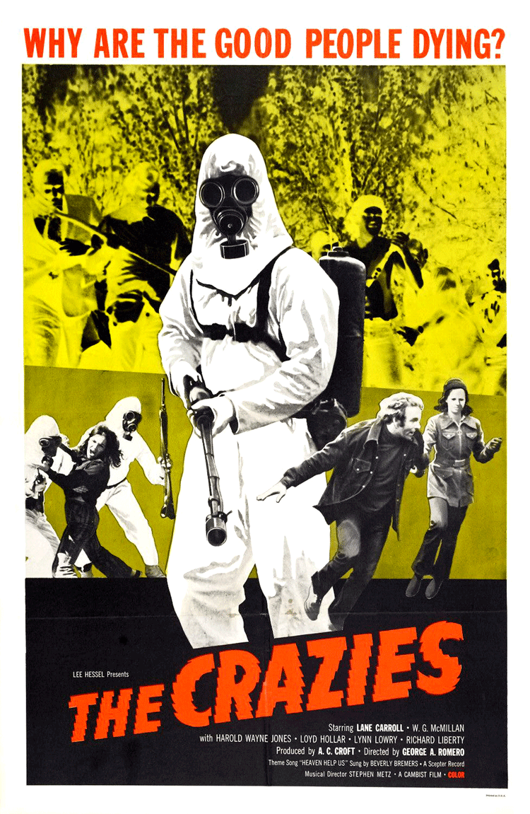
 First up, The Crazies (1973) - I'm not a particularly huge fan of the movie, but this poster is nearly perfect.
Thanks to its slightly cruddy, slapped-together look, it resembles a hastily-assembled PSA-type announcement that a local government might be forced to make in an emergency...not unlike the very one that takes place in the movie! The use of overly saturated colors contrast well with the main black and white figure, giving you an instant feeling of unease.
Since the budget for the film was low, one can only assume that not a lot of money was spent on the advertising. If that's the case, then The Crazies got way more than its money's worth from this one-sheet.
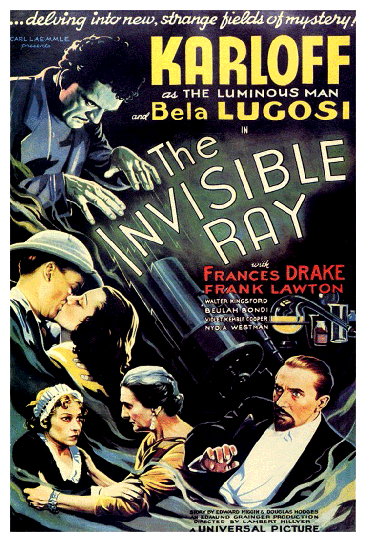
Next on the list is The Invisible Ray (1936). It would have been easy to cull all ten posters for this list from the 1930s and 40s, since it was during this period that movie poster advertising really came into its own. Posters like this make the movie look so exciting, you simply can't risk missing it.
With Boris Karloff (oh, excuse me, KARLOFF) pointing down and across the poster towards his adversary (Lugosi, of course), and the waves of energy sweeping back up towards the top, the artist(s) of this one-sheet create a beautiful, circular design that brings you right back to where you started. And with the extra-large "I", it looks as though the title itself in emanating from Karloff's luminous hands. A real beauty all around.
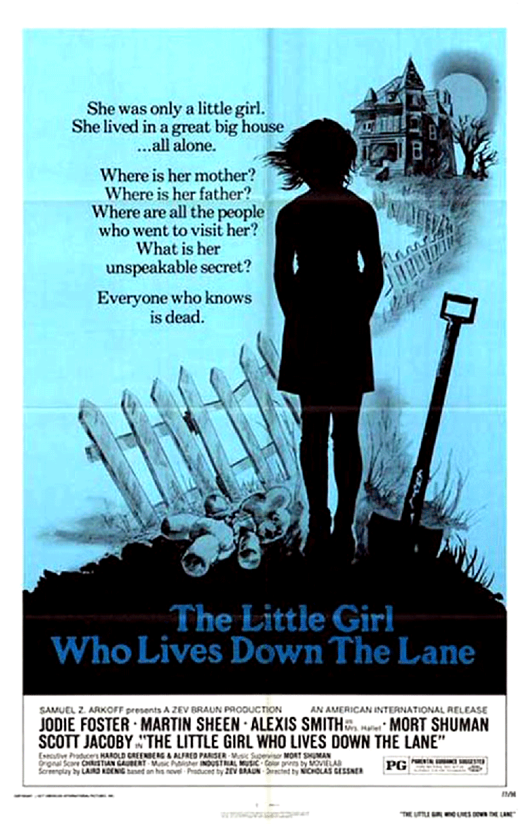
Third in line is The Little Girl Who Lives Down The Lane (1976). I didn't see it in a theater and the artwork wasn't used for the film's release on VHS. It had been replaced by a bland painting, as if the studio was trying to hide the kind of film they had--not a horror film, exactly, but certainly a pretty rough psychological drama. I'm not sure how I came across it.
All I know is, it stuck with me all these years and when working on this piece, I searched it out for inclusion.
Like The Invisible Ray, this poster's design features a nice guide for the eye, starting at the upper right corner down across to the title. It must have been a fight with the studio to keep little insets of the stars (Jodie Foster, Martin Sheen) off the artwork and go with the much less commercial silhouette-only, monochromatic look.
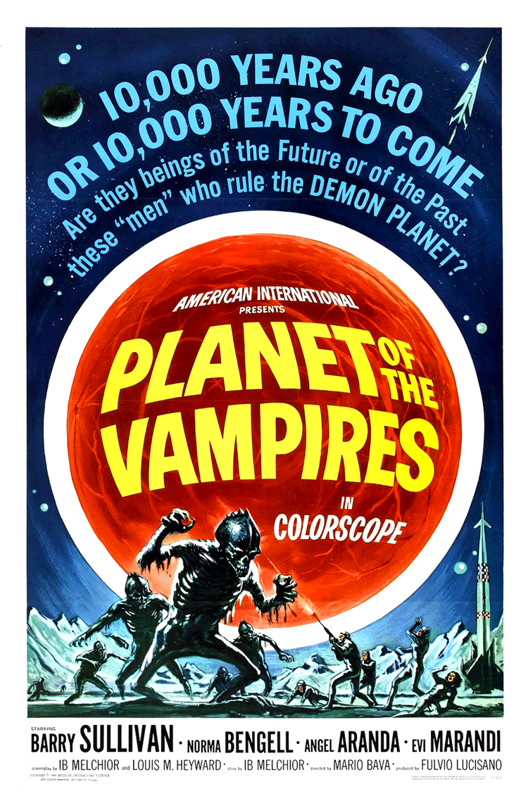
Coming in at number four is one of my all-time favorites: the poster for Mario Bava's 1965 Planet of the the Vampires works in almost any configuration.
The giant, bright red orb works as both a realistic and abstract design element, and pops off the poster. The bright yellow lettering doesn't hurt. Of course, there's perhaps nothing this exciting-looking in the movie, but who cares? It feels creepy and weird, which is all you need to sell a film like this.
This poster was painted by one of the geniuses of movie art, Reynold Brown. In an age where most of this type of work went uncredited, Brown managed to become a huge name in the industry, and we have him to thank for some of the most iconic horror and sci-fi imagery of the last half-century.
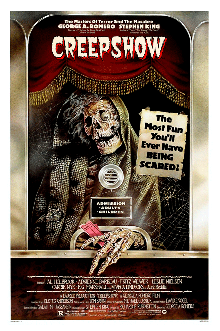
Next at five is a poster many remember vividly. I was too young to see Creepshow (1982) in a theater, but I knew I really wanted to. When it finally came to cable, I tried to catch it every time I could, and it freaked me out.
This poster's tagline ("The Most Fun You'll Ever Have Being Scared!") alerts you that this won't be the most serious of horror films. The title font helps with that as well, perfectly capturing the ghoulish fun of the old E.C. Comics, which Creepshow was so consciously replicating.
The Creepshow poster is credited to legendary E.C. artist Jack Kamen, who also drew some of the comic book pages seen in the film itself. According to legend, Stephen King wanted another E.C. artist, Graham Ingels, to do the job, but he turned it down. Kamen was recommended by William M. Gaines himself, who ended up doing a smashing job.
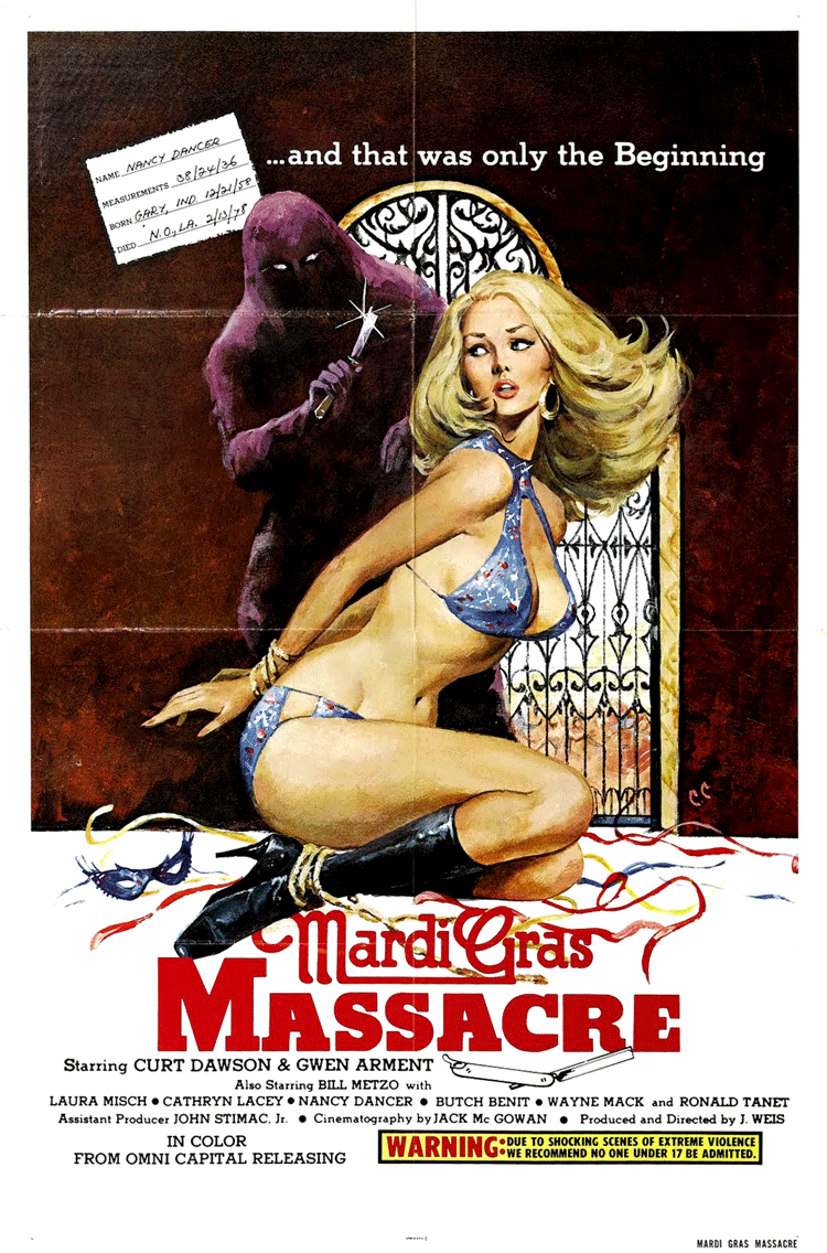
Sixth is this poster for Mardi Gras Massacre (1978). Definitely an off-beat choice. (Who is that with the knife, Grimace?) I first saw it on the film's VHS box at a video store, and was looking for some obscure horror.
But the beautiful, Frank Frazetta-esque woman in skimpy clothing appealed to me at the time, and the absurdly direct title was enough of a lure that I took it home.
Watching the movie, I became retroactively even more impressed with the poster, because the film is incredibly cheap and grubby-looking, baring virtually no resemblance to what you see here. The poster is definitely the classiest thing about the film.
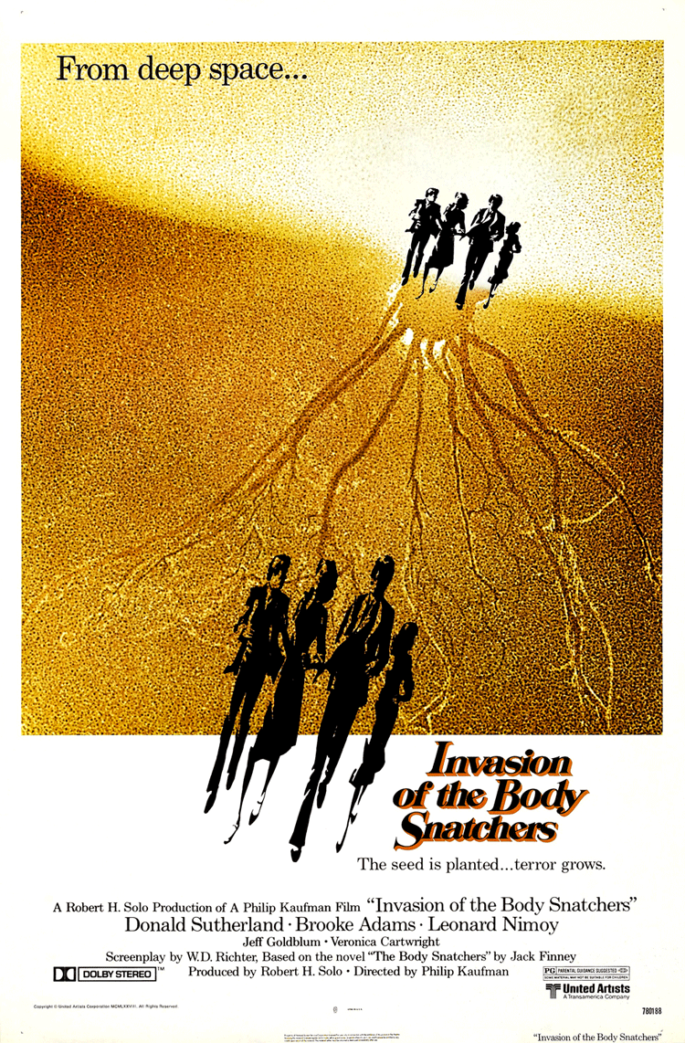
Number seven is the poster for the 1978 remake of Invasion of the Body Snatchers. It ran on the back and inside covers of nearly every comic book I bought. It creeped me out at the time, and I didn't exactly know why.
With the benefit of hindsight, I marvel at how low-key it is. No stars, no aliens, just a niggling feeling of something being not right under the surface. The use of what looks like stock art for the people gives the poster a generic, vaguely Americana kind of feel, a nice visual reference to A) the plot, and B) the time period of the original film, the conformist 1950s.
You could use the same stock for any number of purposes, for example an ad for vacations, or back to school shopping, etc. Here, these figures are the harbingers of otherworldly doom.
The poster was designed by Bill Gold, a legendary figure in movie art whose career spanned several decades, creating posters for Bonnie and Clyde, Cool Hand Luke, Diamonds are Forever, and a little film called Casablanca.
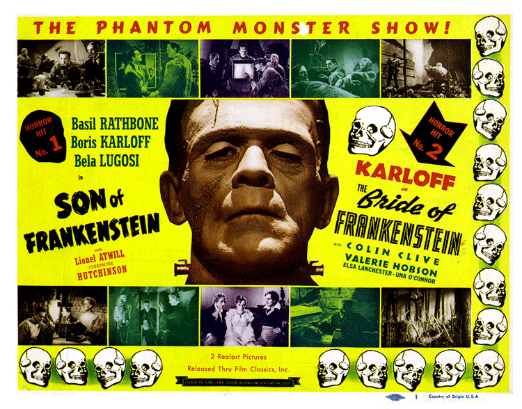
Number eight is perhaps one of the craziest double-bill posters you might see: this one-sheet for a Bride of Frankenstein/Son of Frankenstein double feature looks like it is part of the most fun board game never made. Land on a skull, go back to Start!
While thoroughly unmysterious, the use of photos, cartoony art, gouge-your-eyes-out color and different fonts gives this poster a real hurky-jerky, stitched-together look...which is, of course, perfect when you're talking about Frankenstein!
This image was used on the Laserdisc edition of Son of Frankenstein. An alternate version was used a few years later when the film was released on DVD.
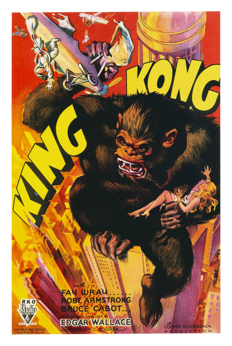
Number nine. I first saw this poster to King Kong (1933) in a book all about horror movie posters called Graven Images. It featured perhaps a dozen different one-sheets and lobby cards generated for the film, but this one practically jumped off the page.
The extremely-forced perspective (New York City looks like it shoots twenty miles into the air) and amazing, dynamic title font treatment make you feel like you're there with Kong and Ann, as the sky is filled with aircraft and the winds threaten to blow you off your perch. The use of reds, oranges, and yellows for the background help Kong pop off the poster, and make the city look like the bowels of Hell. Indeed, from Kong's perspective, it was.
This poster was one of dozens of one-sheets RKO distributed at the time; from the range of styles and quality seen in the pressbook, the studio must have had their entire department working on Kong's advertising.
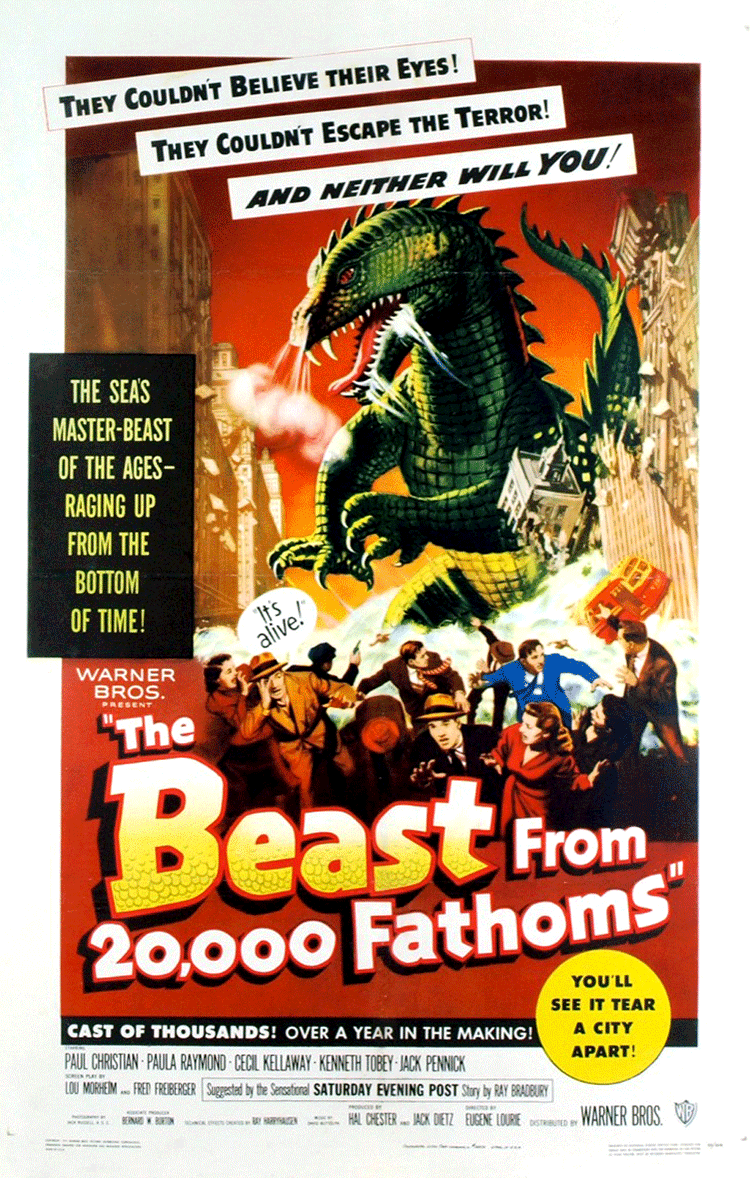
I've saved the "best" for last -- The Beast From 20,000 Fathoms! I remember seeing this 1953 film on TV when I was a kid, but it didn't stick with me any more than a lot of other films I saw during those formative years.
When I saw this poster for the first time, it was as if the skies parted and light shined down on me from above.The colors, the composition, the font choice...to me, every single element of this poster is 100% perfect, coming together to add up to more than the sum of its parts.
All the various blurbs and tag lines (no less than five!) could overwhelm a weaker poster, but by using them to surround the main image (the citizenry running from a fearsome-looking monster), they help inform what's going on. You can almost hear the screaming and chaos that would follow an attack like this, and having all the random catchphrases helps get that feeling across.
When you add in a really fun font (with a nice scaly skin effect at the bottom half of the word "Beast") and a perfect balance of lights and darks, this one represents everything great about movie posters. One never gets tired of looking at it.
There you have it. Ten really great movie posters. Sadly, we don't see many interesting and clever ones much anymore, at least from official studio channels.
However, a quick online search will show that movie poster creativity has not died. There are scores of custom-made one-sheets by talented artists who love the art form so much, they feel compelled to create their own. And who knows? Every major art movement started at the fringes, and eventually worked its way to replace what came before. Perhaps the next Golden Age of Movie Posters is right around the corner...
Robert J. Kelly is a professional graphic designer, illustrator and writer by day, comic book historian by night. His illustrative work is showcased at namtab.com. Kelly also manages several comic and pop culture blogs, including The Aquaman Shrine, TreasuryComics.com, and Hey Kids, Comics! He is currently hard at work writing for his online comic serial Ace Kilroy.
|
|